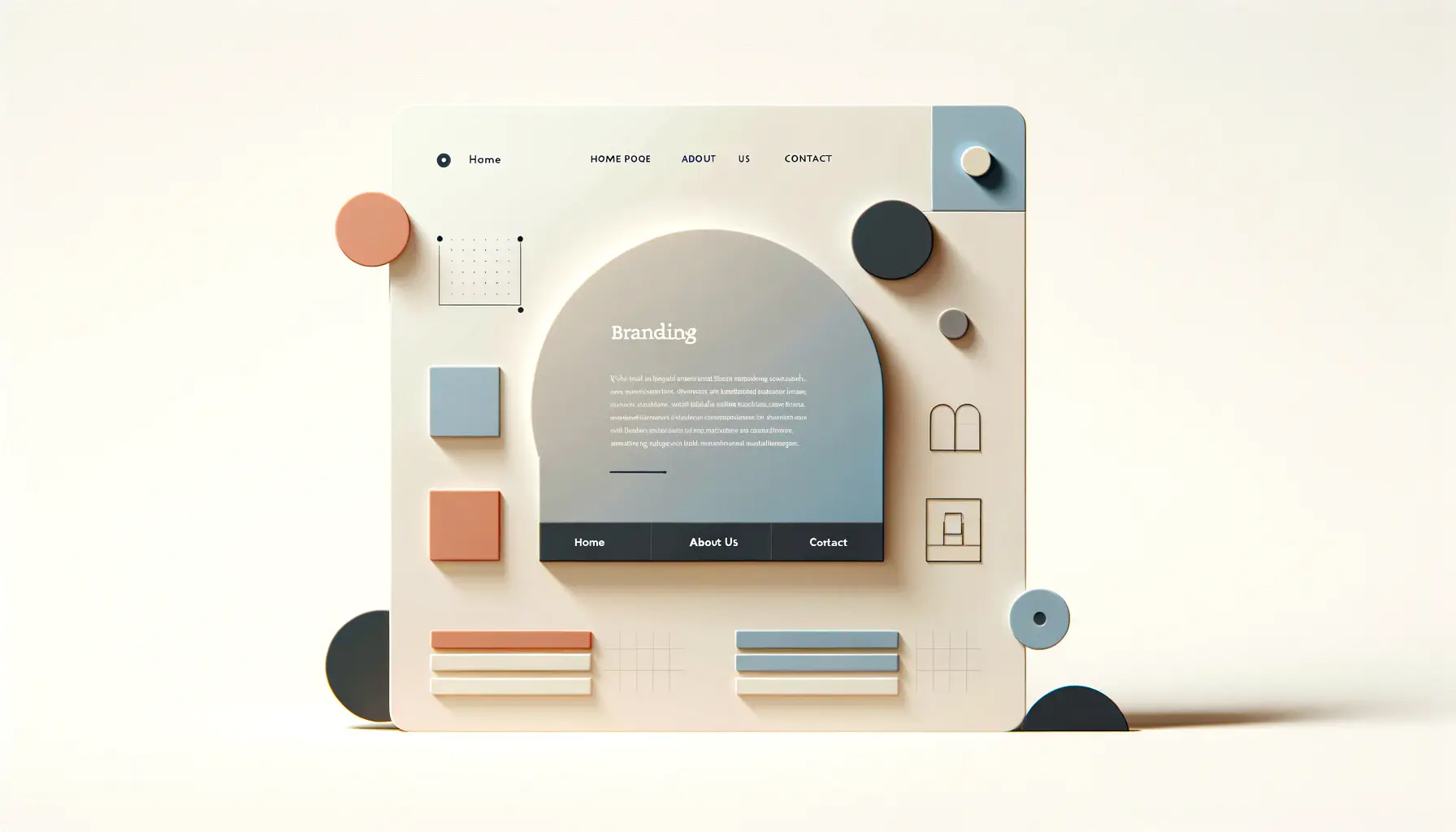
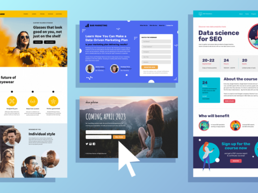
Minimalism in web design is more than a trend; it’s a design philosophy that emphasizes simplicity and functionality. By focusing on essential elements, minimalist design creates clean, user-friendly interfaces. Here’s a detailed look at its benefits and strategies for implementation.
Benefits of Minimalist Design
1. Improved User Experience
Clarity and Focus
Minimalism helps users concentrate on the content without distractions. By reducing visual clutter, it highlights important information, guiding users to what matters most.
Faster Load Times
With fewer elements on the page, minimalist designs typically load faster, enhancing user satisfaction and improving search engine rankings.
2. Better Performance
Reduced Clutter
Simplified layouts mean less code and fewer resources, which boosts website performance. This not only enhances speed but also reduces server load.
Easier Maintenance
Fewer components lead to simplified updates and maintenance. It’s easier to manage content and fix issues when the design is straightforward.
3. Enhanced Aesthetics
Modern and Timeless Appeal
Minimalism offers a clean and modern look that remains appealing over time. This aesthetic simplicity can attract a broader audience and provide a professional appearance.
Strong Visual Impact
With unnecessary elements removed, the remaining visuals have more impact. This can help in creating memorable designs that resonate with users.
4. Increased Accessibility
Simplified Navigation
Minimalist designs often feature intuitive and straightforward navigation, making it easier for users, including those with disabilities, to find information.
Content Focus
With less clutter, assistive technologies can more easily process and present content, improving accessibility for all users.
Strategies for Implementing Minimalist Design
1. Prioritize Content
Essential Elements Only
Focus on what truly matters. Every element should serve a specific purpose, whether it’s functional or enhancing user experience.
Whitespace Utilization
Whitespace, or negative space, is crucial in minimalist design. It helps separate content, improve readability, and guide users’ focus.
2. Simple Navigation
Streamlined Menus
Keep navigation menus concise, with limited options to reduce cognitive load. This makes it easier for users to find what they need quickly.
Clear Hierarchy
Organize content logically with headings and subheadings. A clear hierarchy helps users navigate through information smoothly.
3. Consistent Typography
Limited Font Choices
Use a minimal number of fonts (two or three) to maintain visual consistency. Choose fonts that enhance readability and match the overall aesthetic.
Emphasis on Readability
Prioritize font size, spacing, and contrast to ensure text is easy to read. High readability keeps users engaged and reduces bounce rates.
4. Strategic Use of Color
Neutral Color Palette
Opt for a neutral color palette to create a calm and professional atmosphere. Subtle colors reduce visual noise and focus attention on key elements.
Accent Colors
Use bold accent colors sparingly to highlight important actions or information. This helps draw attention to CTAs (call-to-actions) and other interactive elements.
5. Simplified Visual Elements
Iconography
Utilize simple, recognizable icons to convey information quickly. Icons should complement the overall design without overwhelming the user.
Minimal Graphics
Use graphics selectively. Each image or graphic should have a clear purpose, whether to support the content or enhance the overall design aesthetic.
Conclusion
Adopting a minimalist design approach can significantly improve user experience, performance, and accessibility. By focusing on essential elements and removing distractions, you create a clean, efficient, and visually appealing website. Implementing the strategies outlined above will help you embrace minimalism effectively, providing users with an engaging and memorable experience.

