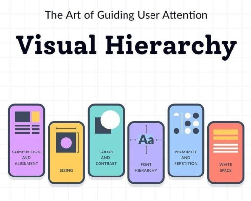
Mastering Visual Hierarchy: The Art of Guiding User Attention in Graphic and Web Design sounds like a comprehensive guide to one of the most crucial aspects of design. Visual hierarchy is essential in effectively communicating information and guiding users through a design layout, whether it’s a website, graphic, or any other visual medium. Here ,one might expect to find:
Fundamentals of Visual Perception
Understanding how humans perceive visual information lays the essential groundwork for creating effective visual hierarchies. By comprehending the intricacies of visual perception, designers can strategically manipulate elements within their designs to guide user attention, facilitate information processing, and enhance overall user experience. From the way the brain processes visual stimuli to the mechanisms of attention and perceptual grouping, a deep understanding of these fundamentals empowers designers to craft layouts that are not only visually appealing but also intuitive and easy to navigate. Whether it’s leveraging principles of Gestalt psychology to organize elements into cohesive groups or considering the impact of factors like visual saliency and depth perception, the insights gleaned from studying visual perception serve as invaluable tools in the designer’s arsenal. Furthermore, by recognizing the influence of developmental stages, cultural backgrounds, and perceptual biases, designers can create designs that resonate with diverse audiences and effectively communicate their intended message. Ultimately, a solid grasp of the fundamentals of visual perception empowers designers to create visual hierarchies that captivate, inform, and delight users across various mediums and platforms.
Hierarchy Principles
Hierarchy principles are foundational guidelines in design that dictate how elements should be organized to convey importance and guide user attention effectively. By employing techniques such as contrast, alignment, proximity, and repetition, designers can establish a clear visual hierarchy within their compositions. This hierarchy enables users to quickly grasp the structure of information, prioritize key elements, and navigate through the design with ease. Whether it’s through bold typography, strategic placement of elements, or consistent visual cues, mastering hierarchy principles ensures that designs are not only visually appealing but also intuitive and user-friendly.
Typography and Layout
Typography and layout play pivotal roles in guiding user attention and organizing information effectively within designs. Typography choices, including font styles, sizes, and weights, can convey hierarchy and emphasize key content, directing users to essential information. Additionally, thoughtful layout design, such as grid systems and whitespace management, helps create visual order and structure, facilitating ease of comprehension. By strategically combining typography and layout techniques, designers can craft visually appealing compositions that lead users through content in a logical and intuitive manner, enhancing overall readability and user experience.
Color Theory
Color theory is the study of how colors interact and influence human perception. In design, color choices play a crucial role in establishing hierarchy and directing user attention. By utilizing contrasting colors, designers can create visual emphasis, drawing attention to important elements and distinguishing them from surrounding content. For instance, using bold or vibrant colors for primary elements and subdued tones for secondary ones can effectively communicate hierarchy. Additionally, color can evoke specific emotions or associations, further shaping users’ perceptions and guiding their focus within a design. Through thoughtful application of color theory, designers can enhance clarity, visual appeal, and user engagement in their compositions.
Responsive Design Considerations
Responsive design considerations involve ensuring that visual hierarchy adapts seamlessly to various screen sizes and devices in web design. This adaptation is crucial for maintaining clarity and usability across different platforms. Designers achieve this by employing flexible layouts, scalable typography, and adaptive image sizes. Elements of visual hierarchy, such as font sizes, spacing, and arrangement, dynamically adjust to accommodate the available screen real estate while preserving the intended hierarchy of information. Through responsive design techniques, designers ensure that users can easily navigate and engage with content regardless of the device they are using, thus providing a consistent and optimized experience across a range of screen sizes and resolutions.
User Experience (UX) Considerations
User Experience (UX) considerations involve integrating visual hierarchy principles into design to enhance usability and user engagement. By strategically applying visual hierarchy, designers can improve the overall user experience by guiding users through content intuitively and efficiently. This integration ensures that key information is prioritized and easily accessible, reducing cognitive load and enhancing comprehension. Moreover, by aligning visual hierarchy with UX principles such as information architecture and interaction design, designers can create cohesive and user-centric experiences. Through thoughtful integration of visual hierarchy with UX design, designers can optimize usability, foster engagement, and ultimately create more effective and satisfying experiences for users.
Conclusion
In Conclusion, “Mastering Visual Hierarchy” empowers designers to create designs that not only captivate users but also communicate information clearly, foster engagement, and enhance overall user experience. As the digital landscape continues to evolve, mastering visual hierarchy remains an essential skill for designers striving to create impactful and successful designs in graphic and web design domains.


