
In the world of web and graphic design, color is more than just a visual element—it’s a powerful tool that can influence user emotions, perceptions, and actions. Understanding the psychological impact of color and how to apply it effectively can elevate your designs and make them more engaging and persuasive. In this blog, we’ll explore the basics of color psychology and offer tips on how to use colors to your advantage in web and graphic design.
Understanding Color Psychology
Color psychology is the study of how colors affect human behavior and emotions. Each color evokes certain feelings and associations, which can vary depending on cultural context, personal experiences, and even trends. For designers, knowing these associations is crucial for creating visuals that resonate with the target audience and elicit the desired emotional response.
Here’s a breakdown of common color associations:
- Red: Passion, urgency, excitement, and energy. Often used in call-to-action buttons, sales promotions, and to evoke strong emotions.
- Blue: Trust, calmness, and professionalism. Popular in corporate websites and brands that want to convey reliability.
- Green: Nature, growth, and health. Commonly used in eco-friendly brands and products related to wellness or finance.
- Yellow: Happiness, optimism, and warmth. Used to grab attention and evoke a sense of positivity.
- Black: Sophistication, elegance, and luxury. Often used in high-end brands to create a sense of exclusivity.
- White: Purity, simplicity, and cleanliness. A versatile color that works well in minimalist designs and to create space.
The Role of Color in Web and Graphic Design
Colors influence how users interact with a website or graphic. Here are several ways color psychology plays a crucial role in web and graphic design:
1. Establishing Brand Identity
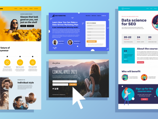
Colors are key to defining a brand’s identity. Think of major brands like Coca-Cola (red) or Facebook (blue). These brands are instantly recognizable due to their consistent use of color across all platforms. By choosing the right colors, designers can convey a brand’s personality and values. For example, if you’re designing for a wellness brand, green may help symbolize health and growth, while a tech brand might prefer blue to indicate trust and innovation.
2. Directing Attention
Color can guide a user’s focus. In web design, contrasting colors are often used to draw attention to important elements such as buttons, headlines, or key information. For instance, a bright red “Buy Now” button on a neutral background is hard to ignore. This strategic use of color helps direct users’ attention toward conversion points, improving user engagement and interactions.
3. Enhancing Readability and Accessibility
The right color combinations can improve readability, making content easier to digest. Text that contrasts sharply with its background is easier to read. For example, black text on a white background offers the highest level of readability. However, designers must also consider color accessibility for users with color vision deficiencies. Tools like color contrast checkers can ensure that the design is accessible to a wider audience.
4. Eliciting Emotional Responses
The emotional impact of color is often subtle but significant. Designers can leverage this by choosing colors that align with the emotions they want to evoke in users. For instance, a charity website might use warm colors like red or orange to evoke feelings of compassion and urgency, while a financial services website might use blue to convey trust and stability.
5. Building a Cohesive Visual Experience
Color can be used to create a cohesive experience across different elements of a design. By maintaining a consistent color palette, designers ensure that the visual flow remains uninterrupted, guiding users naturally through the content. Consistency in color usage helps reinforce brand identity and provides a harmonious user experience.
Tips for Using Color Effectively in Design
Now that we understand the importance of color psychology, here are some practical tips for applying it in web and graphic design:
1. Choose a Color Palette Wisely
Start by selecting a base color that represents your brand or the emotions you want to evoke. Then, build a complementary color palette around it. Tools like Adobe Color or Coolors can help you experiment with different color schemes. Stick to 3-5 primary colors to maintain consistency across the design.
2. Consider the Cultural Context
Colors can have different meanings across cultures. For example, while white symbolizes purity in many Western cultures, it is often associated with mourning in some Eastern cultures. If your design is intended for a global audience, be mindful of these cultural nuances to avoid unintended negative associations.
3. Use Contrast for Emphasis
To highlight important elements like calls-to-action, use contrasting colors. A bold color for your CTA button can increase click-through rates and conversions. However, avoid using too many contrasting colors in one space, as it can overwhelm the user.
4. Test Your Color Combinations
What looks good to the designer might not always appeal to the end user. A/B testing different color schemes on a website or design can help determine what resonates best with the audience. By experimenting with color combinations, you can find the balance that drives the best user engagement.
5. Incorporate Neutrals
Neutral colors like white, gray, or beige can help balance out brighter hues and give users a visual break. These colors can also be used to create negative space, making the design feel less cluttered and more focused on important elements.
Color is a fundamental aspect of web and graphic design that extends far beyond aesthetics. By understanding and applying color psychology, designers can create visually appealing designs that engage users emotionally, guide their actions, and enhance their overall experience. Whether you’re building a brand, designing a website, or creating promotional materials, the strategic use of color can be a game-changer in delivering impactful and memorable designs.