In the digital age, where attention spans are short and information overload is common, visual communication has become a crucial element in effective graphic and web design. Visual communication involves the use of images, symbols, colors, typography, and other visual elements to convey messages and ideas. Unlike text-heavy content, which requires time and effort to process, visuals can communicate complex concepts quickly and efficiently. This ability to convey information at a glance is why visual communication is so powerful in graphic and web design. In this article, we’ll explore the importance of visual communication, the key elements that contribute to its effectiveness, and how to harness its power in your design projects.
The Importance of Visual Communication
Visual communication is essential because it taps into the human brain’s natural ability to process images faster than text. Studies have shown that the brain can process visuals up to 60,000 times faster than text, making visual communication an incredibly efficient way to convey information. This is especially important in today’s fast-paced digital environment, where users often skim through content rather than reading it in detail. By using visuals strategically, designers can capture attention, convey messages more effectively, and enhance user engagement.
Moreover, visual communication transcends language barriers. Images, icons, and symbols can be understood universally, making them an invaluable tool for reaching a global audience. This is particularly important in web design, where users from different cultures and backgrounds may interact with your content. By prioritizing visual communication, designers can create inclusive experiences that resonate with a diverse audience.
Key Elements of Visual Communication
To unlock the power of visual communication, it’s essential to understand the key elements that contribute to its effectiveness. These elements include color, typography, imagery, layout, and visual hierarchy. Each plays a unique role in how information is perceived and understood.
1. Color
Color is one of the most powerful tools in visual communication. It can evoke emotions, create associations, and influence behavior. For example, red can convey urgency or passion, while blue is often associated with trust and calmness. In graphic and web design, color is used to establish brand identity, highlight important information, and guide users’ attention. A well-thought-out color scheme can make a design more visually appealing and easier to navigate, while a poor choice of colors can lead to confusion and disengagement.
When selecting colors, it’s important to consider color psychology, cultural associations, and accessibility. For example, certain colors may have different meanings in different cultures, and designers should be mindful of color contrast to ensure that content is accessible to users with visual impairments.
2. Typography
Typography is the art of arranging text in a visually appealing way. It involves the selection of fonts, sizes, spacing, and alignment to create a hierarchy of information. Typography not only affects readability but also sets the tone of the design. For instance, serif fonts are often associated with tradition and formality, while sans-serif fonts convey modernity and simplicity.
In visual communication, typography plays a crucial role in guiding the user’s eye through the content. By using different font sizes and styles, designers can create a visual hierarchy that helps users quickly identify headings, subheadings, and body text. Additionally, the choice of typography can reinforce the overall message of the design, making it more impactful and memorable.
3. Imagery
Images are at the heart of visual communication. Whether it’s photographs, illustrations, icons, or infographics, imagery can convey complex ideas and emotions in an instant. High-quality images can capture attention, evoke emotions, and create a strong visual impact. In web design, images are often used to break up text, illustrate concepts, and enhance the overall user experience.
When using imagery, it’s important to ensure that it aligns with the overall message and tone of the design. Stock photos, while convenient, should be chosen carefully to avoid clichés and maintain authenticity. Custom illustrations and icons can add a unique touch to the design, making it more memorable and engaging. Additionally, designers should consider the technical aspects of imagery, such as file size and resolution, to ensure that images load quickly and look sharp on all devices.
4. Layout
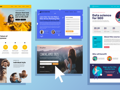
The layout is the arrangement of visual elements on a page. A well-designed layout ensures that information is presented in a logical and visually appealing way. In web design, the layout is crucial for creating a positive user experience, as it determines how users navigate the site and interact with content.
Grid systems are often used in layout design to create a sense of order and balance. By aligning elements to a grid, designers can create a harmonious composition that is easy to follow. Additionally, white space, or the empty space between elements, plays a crucial role in layout design. White space helps to separate different sections of content, making it easier for users to process information and focus on the most important elements.
5. Visual Hierarchy
Visual hierarchy refers to the arrangement of elements in a way that guides the viewer’s eye through the content in order of importance. It is achieved through the strategic use of size, color, contrast, and positioning. For example, larger, bold text is often used for headings to draw attention, while smaller, lighter text is used for body content.
Effective visual hierarchy ensures that users can quickly identify key information and understand the structure of the content. In web design, this might involve placing the most important content above the fold, using contrasting colors for call-to-action buttons, or highlighting key features with icons and images. By establishing a clear visual hierarchy, designers can make their content more accessible, engaging, and easier to navigate.
Harnessing the Power of Visual Communication
To harness the power of visual communication in graphic and web design, it’s important to take a user-centered approach. This involves understanding the needs, preferences, and behaviors of your target audience and designing with them in mind. Here are some practical tips for incorporating visual communication into your design projects:
1. Start with a Clear Message
Before diving into the design, clarify the message you want to convey. What is the primary goal of your design? What action do you want users to take? By starting with a clear message, you can ensure that every visual element supports that message and contributes to the overall effectiveness of the design.
2. Use Visuals to Simplify Complex Information
Visuals are particularly effective at simplifying complex information. Infographics, charts, and diagrams can be used to present data in a way that is easy to understand and visually engaging. By breaking down complex concepts into visual elements, you can make your content more accessible and appealing to a broader audience.
3. Test and Iterate
Design is an iterative process, and visual communication is no exception. Testing your designs with real users can provide valuable insights into how effectively your visuals are communicating the intended message. Based on feedback, you can make adjustments to improve clarity, impact, and usability.
Visual communication is a powerful tool in graphic and web design, enabling designers to convey messages quickly, effectively, and across cultural boundaries. By understanding and applying the key elements of visual communication—color, typography, imagery, layout, and visual hierarchy—designers can create engaging, memorable, and user-friendly experiences. As the digital landscape continues to evolve, the importance of visual communication will only grow, making it an essential skill for any designer looking to make a lasting impact in their field.


